
Craft · How the work gets made
What the light in Barcelona taught me about colour
Alastair Marshall, Co-Founder & Director
4 min read
I was in Barcelona recently shooting a photo series for a Spanish travel website. Good brief, good light, long days. On one of them I found myself standing in the middle of Sagrada Familia, looking up, not taking a single photograph.
I knew the building was famous for its stained glass. I did not expect it to teach me something about my job.
A story told entirely in colour
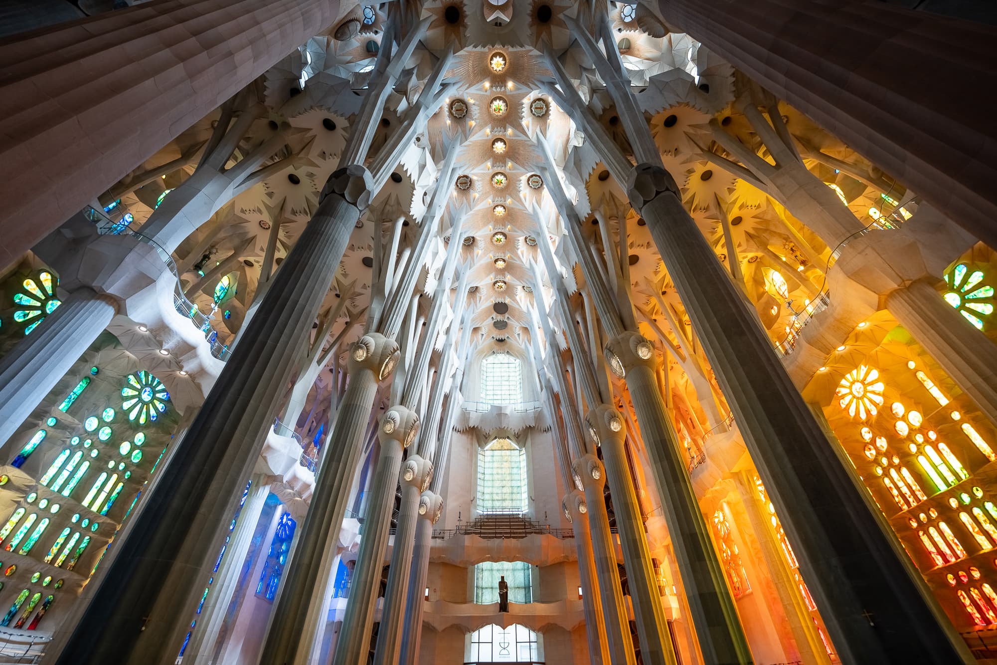
Stand in the nave and turn your head from one side to the other. On the Nativity side of the basilica, the glass runs cool. Greens and blues pour in like morning. It feels like beginnings. Cross to the Passion side and everything changes. The windows burn red, orange and gold, and in the late afternoon the sun sets them alight.
Birth on one side. Death on the other. The entire arc of the story, told without a word of text, a single image of a face, or a caption to explain it. Just colour and light, and the direction the sun happens to travel.
Gaudí understood something that every brand should understand. Colour is not decoration. Colour is narrative. Before your audience reads a headline or recognises a logo, colour has already told them how to feel. It works faster than language because it does not need translating.
Why this matters for brands
We talk to clients about colour a lot, and the conversation usually starts in the wrong place. It starts with preference. Which colours do you like. Which colours do your competitors use.
The better question is the one Gaudí answered. What do you want people to feel, and in what order?
Colour sets emotional temperature before anything else on the page gets a chance. A finance brand wrapped in deep blues is telling you it is steady before you have read a single word about its services. A food brand in warm reds and oranges is making you hungry on sight. That is not an accident, and it is not a trend. It is wiring. We respond to colour the way we respond to weather.
The lesson from Barcelona is about progression as much as palette. The basilica does not use one colour. It moves you through colour, and the movement is the story. Brands can do the same. A campaign can open cool and close warm. A website can shift tone as the visitor travels from discovery to decision. A film can grade its opening differently to its final frame. When colour changes with intent, the audience feels the shift even if they never consciously notice it.
That is what we mean when we talk about imagery at Neon Frame. Not just what is in the frame, but what the frame is doing to the person looking at it.
The other thing the trip gave me
I want to be honest about something else, because I think it matters just as much.
I did not walk into that building looking for a lesson about colour theory. I walked in because I had an afternoon off and it seemed like the thing to do. The insight found me because, for once, I was not staring at a screen.
Creative work has a strange relationship with effort. Push harder at a problem and it often pushes back. Step away and the answer wanders over on its own. Every creative I know has had their best idea in the shower, on a walk, or halfway through a trip that had nothing to do with the brief.
Getting out of the studio is not a break from the work. It is part of the work. New places recalibrate your eye. You notice light again. You notice scale, texture, the way a space makes people move through it. All of that comes home with you and quietly turns up in the next project, the next shoot, the next deck.
So this is my case for building the reset into the process rather than treating it as a reward for finishing. Take the trip. Visit the building. Stand in the middle of it and look up. Your next idea might already be there, waiting in the glass.
One photograph, both halves of the story
The photograph earlier in this piece is one I took standing in the nave. Look at the left side and you see the cool glass of the Nativity windows. Look at the right and the Passion windows are already glowing. The whole narrative sits inside a single frame.
That is the standard we hold our own work to. If one frame can carry a story a century in the making, one frame can carry yours.
Below are a few more images from the trip. Different corners of the same building, different times of day, the same story told in light.
Sagrada Familia, Barcelona
5 frames
01 / 05
A tall apse wall of stained glass in blues, greens and turquoise, with a single panel of red and orange glass at the bottom left corner
If you are thinking about how colour works across your brand, from identity to imagery to film, that is a conversation we would love to have. Get in touch.